
Before starting any repair in the interior, it is essential to thoroughly plan and think over the main points of the interior. One of these key highlights is the color. If you incorporate color effectively, even the most modest interior will be transformed to appear cozy and youthful. If, however, you use color carelessly, then the visuals of the entire interior will be ruined. If you are keen on achieving the best result, then it’s advisable that you seek out the advice of an expert on the most optimal combination of colors suited specifically for your interior.
The essence of color in the interior cannot be overemphasized. Color is what gives the home spirit, mood and exclusivity. After all, each style can work in any color, but not any color combination will necessarily work.
In this article, we address concerns about color including how to choose the right color, how to harmoniously combine different colors and how to achieve excellent results.
Background on Successfully Combining Colors
First you need to understand one important rule when it comes to color combination:
First pick the main color. Once you have decided on the dominant color, you can then embark on picking out the rest. However, remember that both the main color and the supplementary colors should be in line with the design of your home. Some colors themes will not work for particular designs of the interior.
Another important factor to consider is the consistency of the color in the style of the room. For a modern and high-tech style, one color is preferable, while for country, classic and provence – a variety of colors works best.

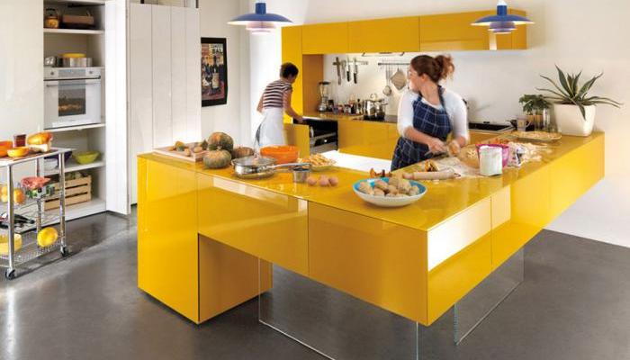
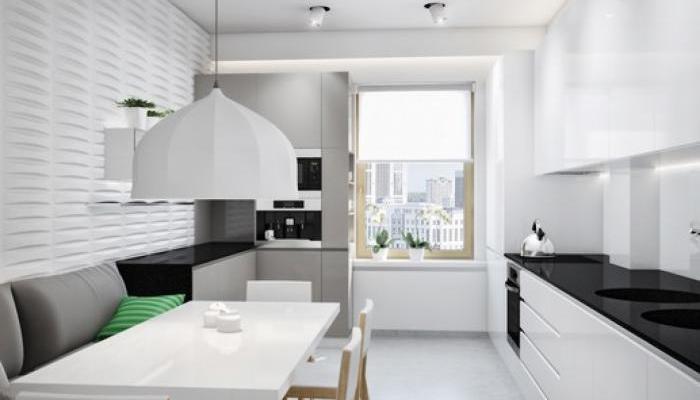
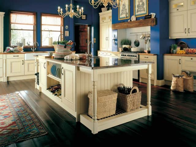
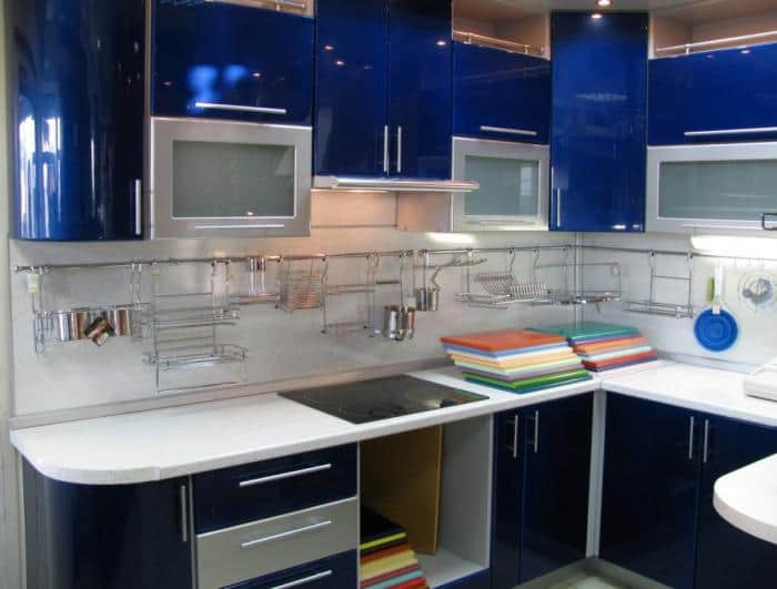
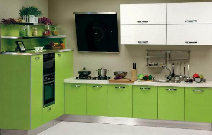
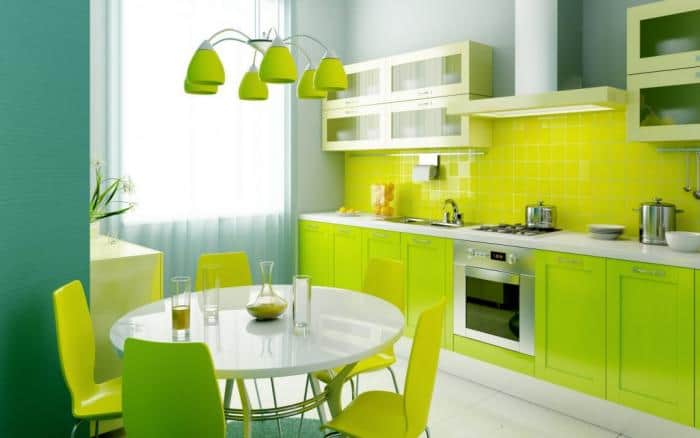
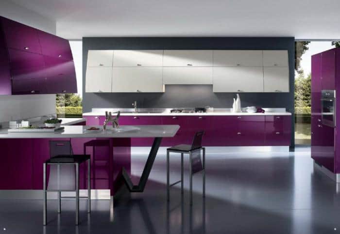
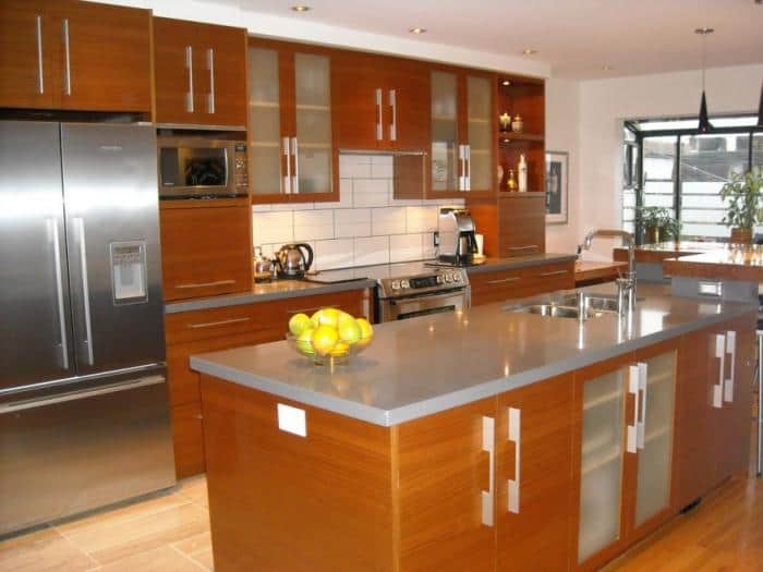
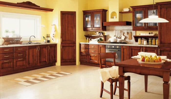
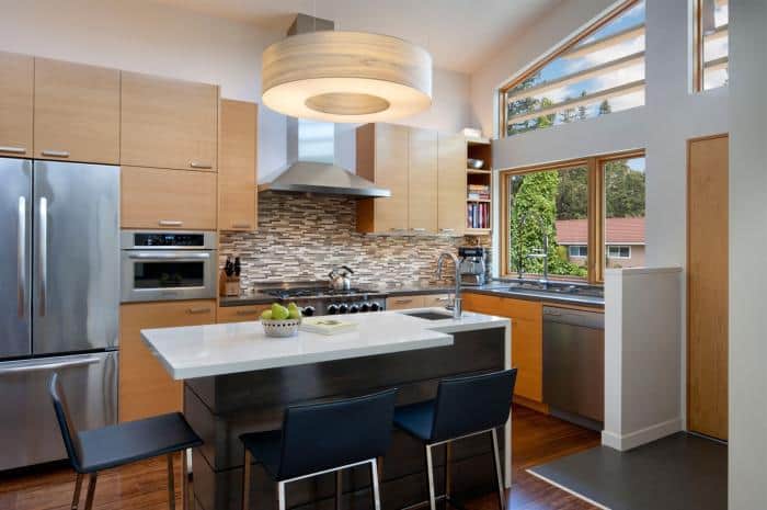
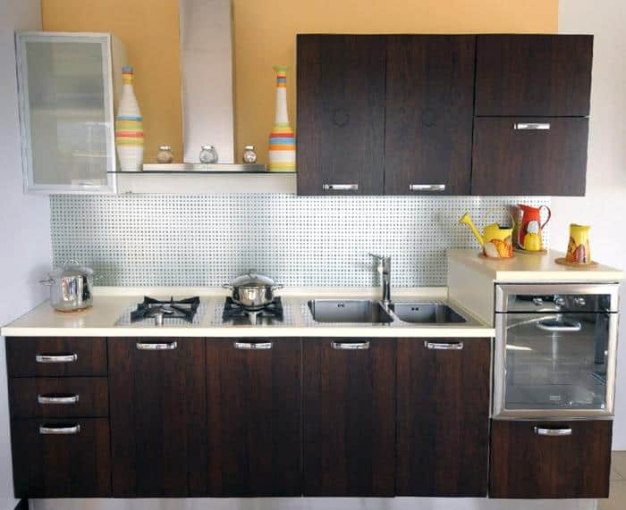
Kitchen
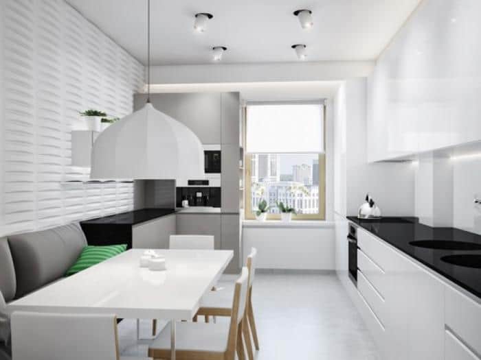
White
When discussing color in the kitchen, what comes to mind for most people is white and variant shades of white. White is universal. It easily fits into the framework of many styles and blends effortlessly with most other colors. A kitchen with a white color scheme symbolizes order and cleanliness. In addition, white introduces a calm and peaceful vibe, which can be almost impossible to achieve with other colors. Use of the white color scheme in the kitchen will always be fashionable, especially when combined with a few bright or contrasting colors such as black. The optimal color combination in the kitchen is white, with red, black, purple or brown highlights.
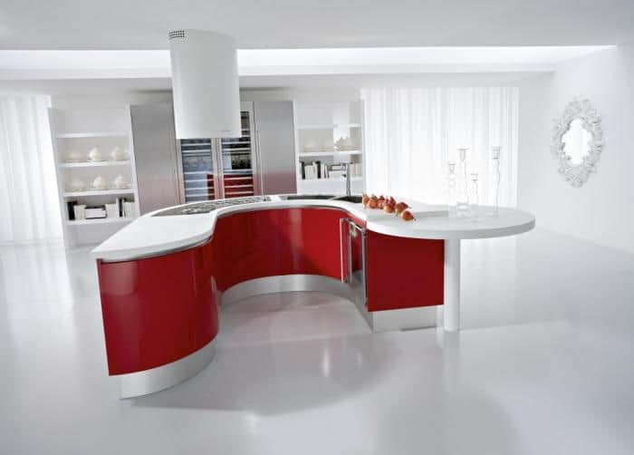
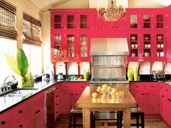
Red
Red is suitable for a spacious kitchen. However, it is important to consider that applying some shades of red or using too much red in the kitchen will suppress the kitchen’s lighting, making it appear darker. To avoid this problem, it is best to choose deep, saturated tones of red. To make the most of red color in the kitchen, introduce design and décor aspects made of metal or glass. If you plan on combining red with other colors, the most suitable accompanying colors are white, black and metallic (for example silver, bronze or gold).
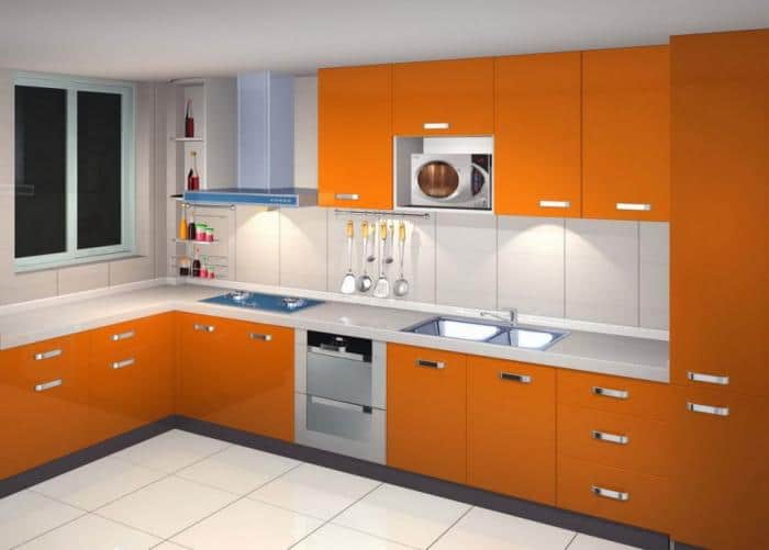
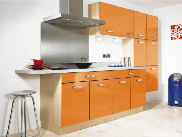
Orange
Pleasant, cheerful, sunny- that is the effect you get when you use orange in the kitchen. Orange is a great choice when you are at crossroads in trying to set a bright yet cozy environment.
Blue
Blue is perfect when applied as the main color in a kitchen that is usually hot. If the window of the kitchen faces to the north, adding blue as the key color will have the effect of making the room feel cool even at high temperatures. Blue seamlessly matches with coral, yellow, orange and white.
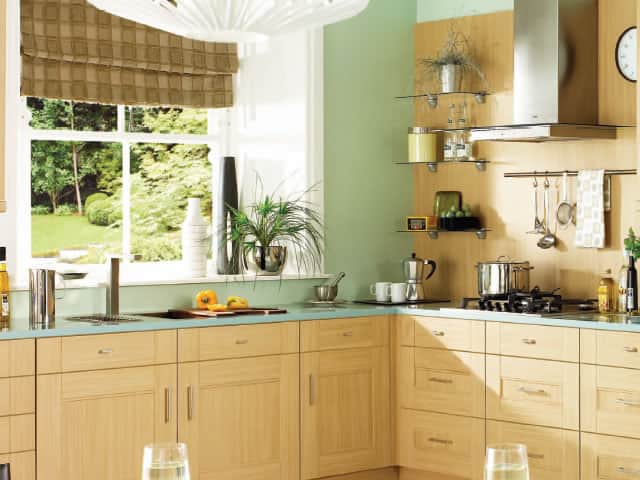
Green
Green is traditionally associated with nature. With regard to the aptness of the choice of green as the primary color for the kitchen, it is arguable. Some homeowners see it as a great option while other homeowners simply do not like the idea. A fun fact that might motivate those who hate green, it has been proven that use of green in the kitchen actually improves digestion! Green color in the kitchen works best in combination with white, yellow and blue.
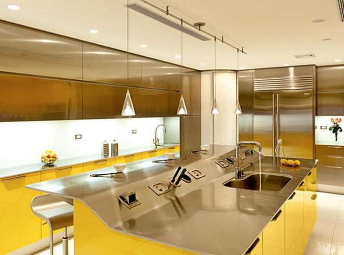
Use yellow as the main color when the lighting is well thought out. Otherwise, the kitchen will look dull and uninteresting. Colors to combine with yellow in the kitchen are white, blue and silver.
Purple color as the main in the kitchen
Adopting purple as the primary color in the kitchen is a pretty bold decision. It is an original idea and that is unusual in the interior. A kitchen in purple will always appear fashionable and out-of-the-box. This color is best combined with olive or ocher-colored tones.
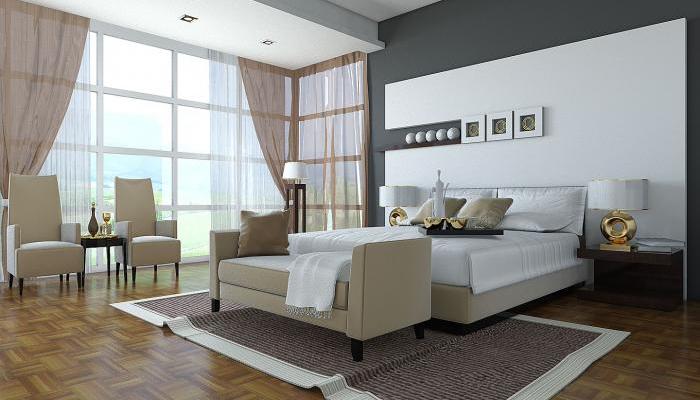
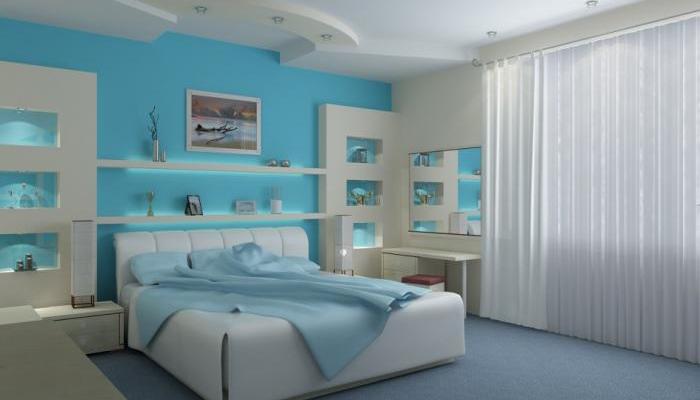
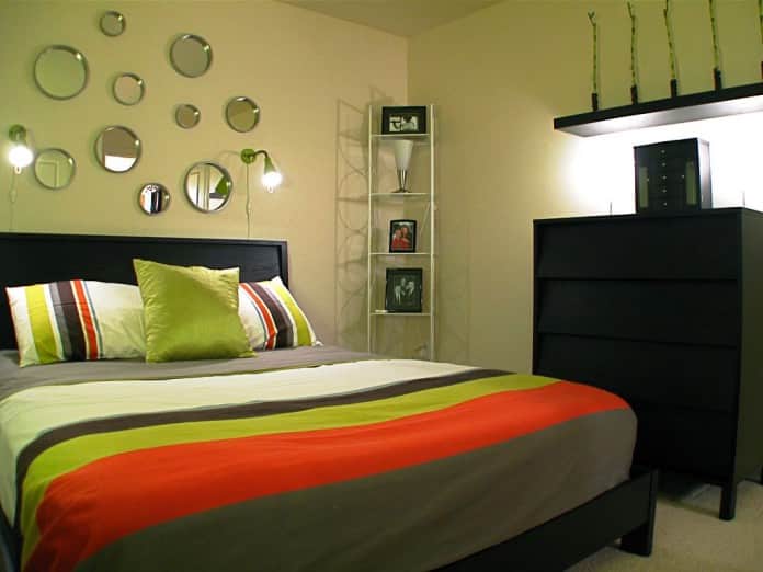
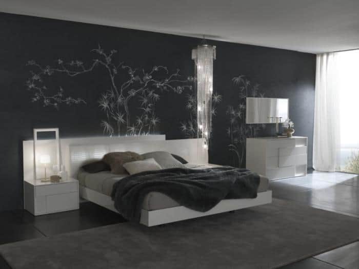
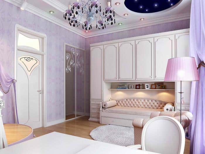
Bedroom
The choice of bedroom colors ought to be taken seriously. After all, this is a place for rest, relaxation and sleep. For many modern people, a bedroom is the only place to rest after a day’s work. It is worth considering this when planning the color scheme of the room.

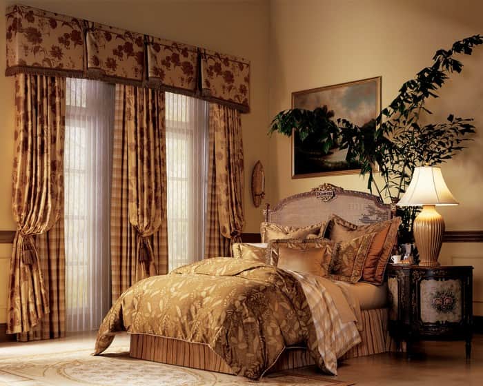
One of the most suitable colors for the bedroom is beige. Beige removes eye fatigue, improves mood and facilitates relaxation. As the main color, it is very convenient, as it is easily combined with many other colors. The most advantageous combinations are beige + white, beige + black, beige + brown, beige + green.

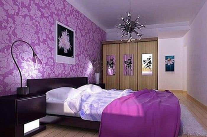
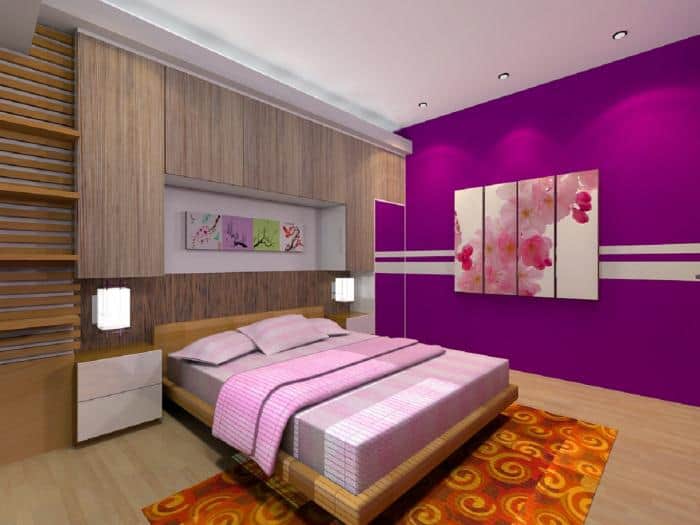
Purple
A bedroom in purple is often the choice for many women. For men, however, this color often evokes a similarity with pink. The best thing about purple is that it is independent and bold, therefore, it can as well be used alone, without combining with other colors.
Caution: Dilute purple with white or light brown so that the bedroom does not look too dark.
Lilac
The lilac color is close to purple. However, it is easier to perceive and complement with other colors. The most successful lilac color scheme in the bedroom is a partnership of lilac with beige or white.
Green
Green in the bedroom symbolizes the cheerfulness of its owner. Fresh and bright greens create cheerful and energetic vibes that will motivate anyone in the morning. There are many combinations that can be achieved with green, depending on the shade of green chosen. If it is a bright, clean tone, then it should be paired with white, yellow, light brown or beige. For deep green, dark brown, blue and deep beige are the best choices.
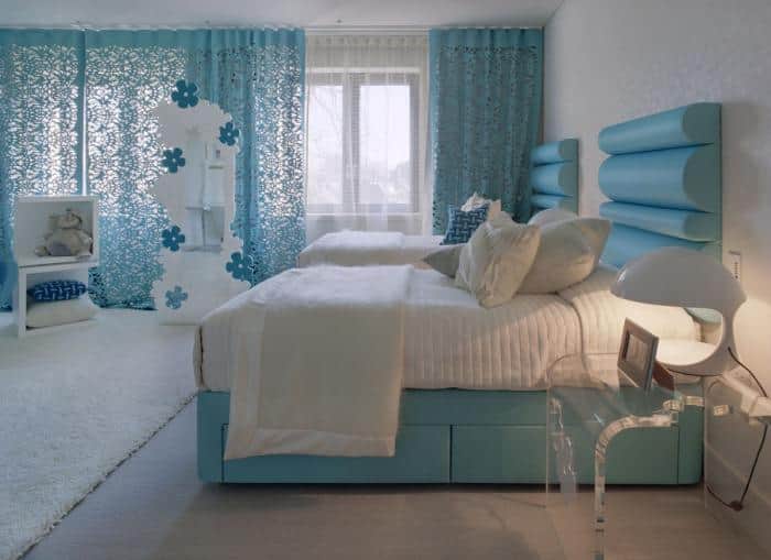
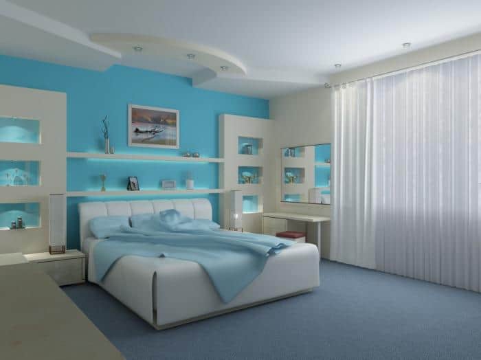
Blue
The bedroom in blue is an option for romantics and dreamers. Blue as the main in the bedroom helps one to relax, drives away heavy thoughts and relieves stress. After all, it is reminiscent of seas and oceans. The blue color in the bedroom blends well with white, light green, red or light brown.
Brown
For the bedroom – this is one of the classic colors. It fits well with green, white, beige or black.
Black in the Bedroom
This is quite an unusual option. If you are not afraid that the interior with the predominant black color will “crush” – then choose it. Dilute black in the bedroom with the help of white and shades of brown. For those with a bold style, a combination of black with pink, bright purple or light purple is just right!
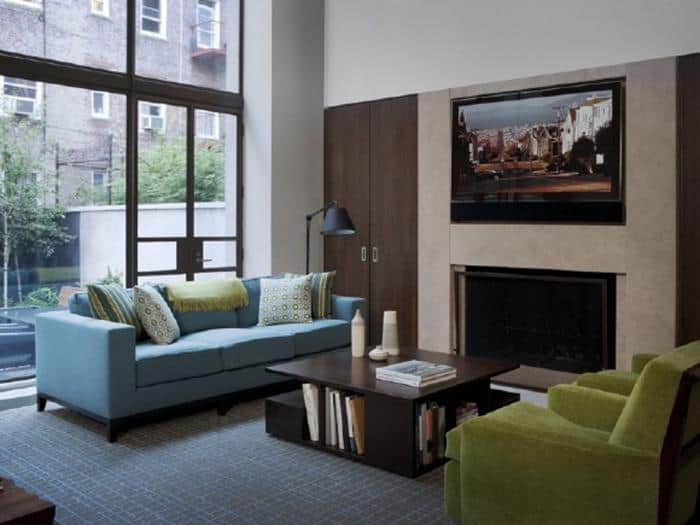
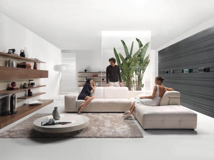
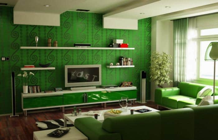
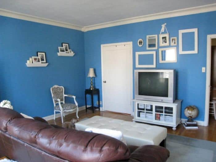
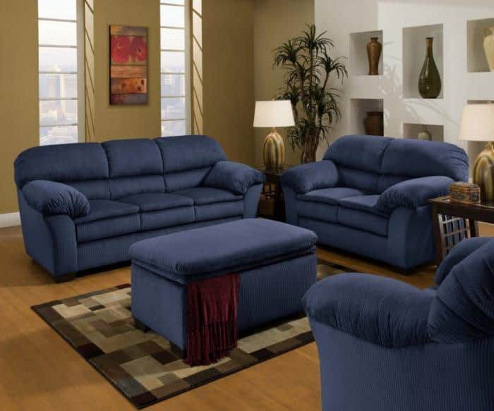
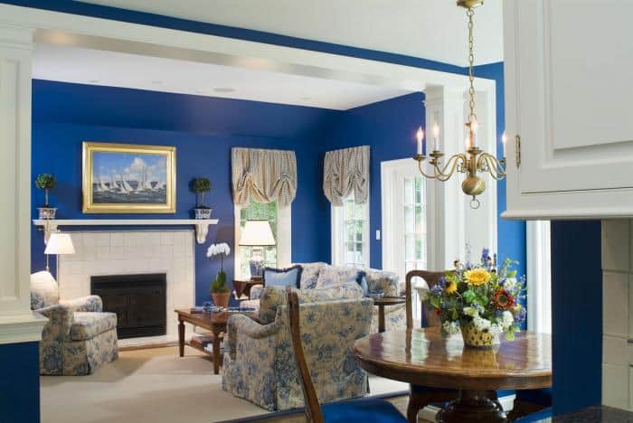
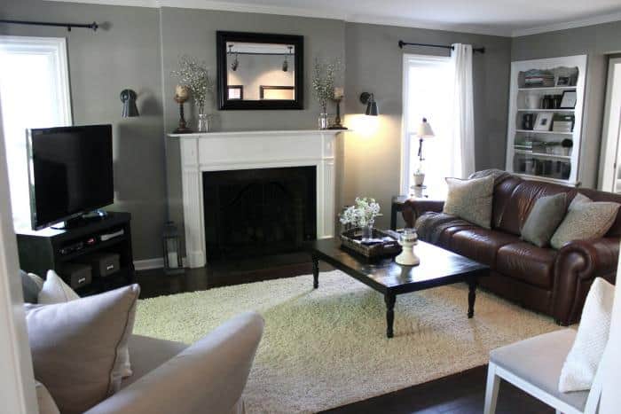
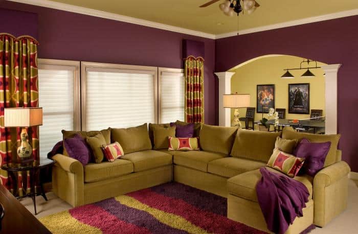
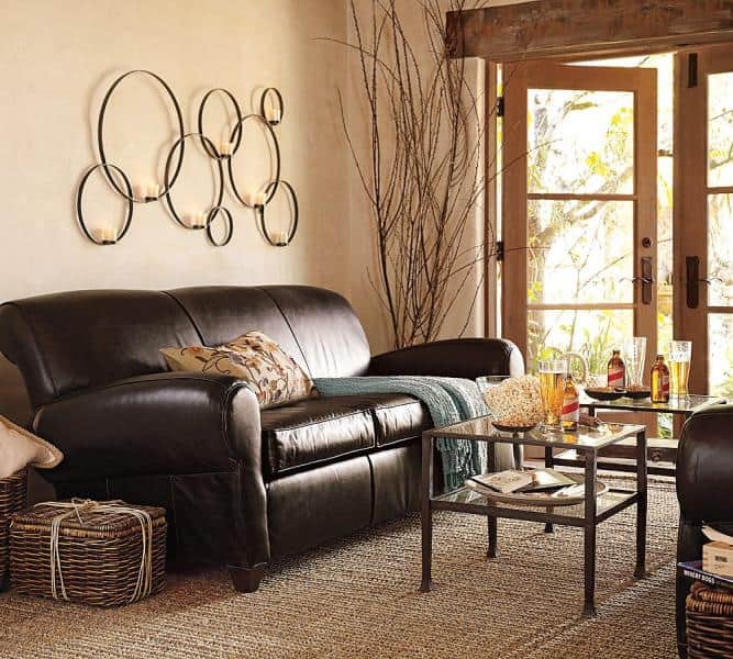
Living room
In a way, the living room is the most important part of the home. It is this room that carries several functions:
- A reception for guests
- Venue for family gatherings
- Home cinema
The design and décor of the living room should therefore be given special attention. This includes the choice of colors.
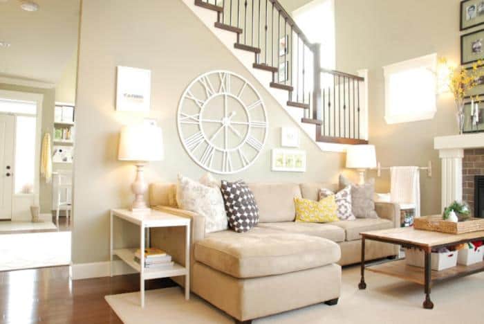
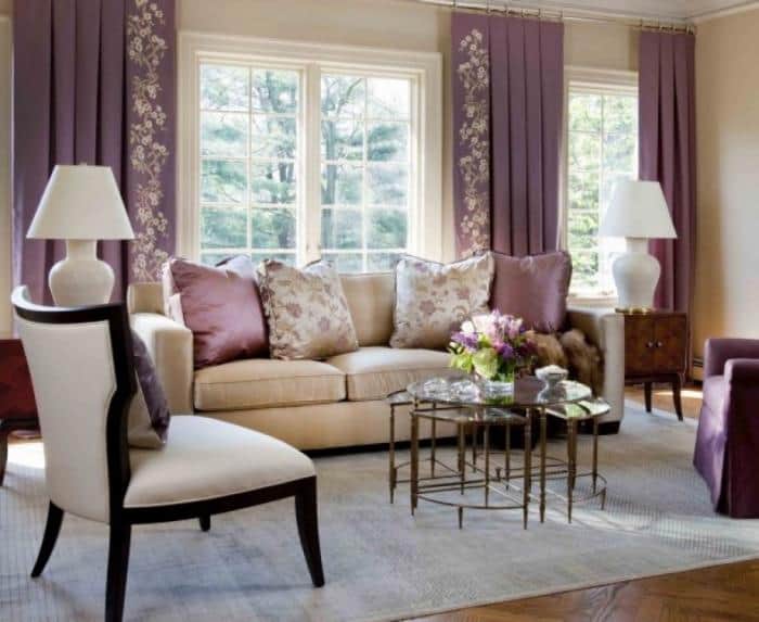
Beige
A living room in beige is a win-win choice. For beige interiors, the supplementary colors should be similar in color palette, as opposed to contrasting. Beige looks great with coffee, brown or golden hues.
Gray
Gray as the main color in the interior of the living room is a fairly rare option. The most important factor in choosing it is the shades. Light pearl shades of gray will give the room an atmosphere of strict sophistication, but the dark ones threaten to make it boring and dull. Gray fits well with orange, pink, black and some shades of green.
Green
Green is a neutral color and it therefore makes a good background color for the living room. Green in deep noble shades makes the interior refined and even “rich”. Good combinations for this color are with brown, white or yellow.
Lilac
Living rooms in lilac color always appear fresh and elegant. Excellent accompaniments to this color are pearly, beige, brown and sandy hues.
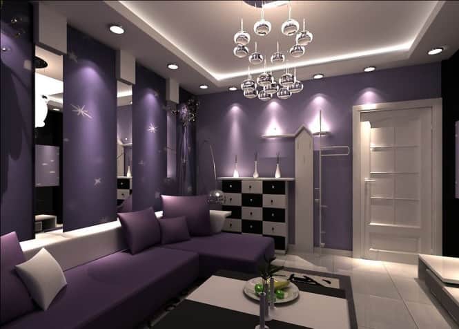
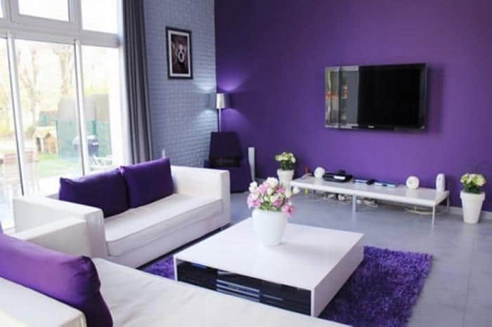
Purple
Use of purple for the living room design and décor is a totally acceptable option. The dark tone of this color gives the room a solemnity, and light airiness. In the living room, purple is best combined with white, red, pink or orange.
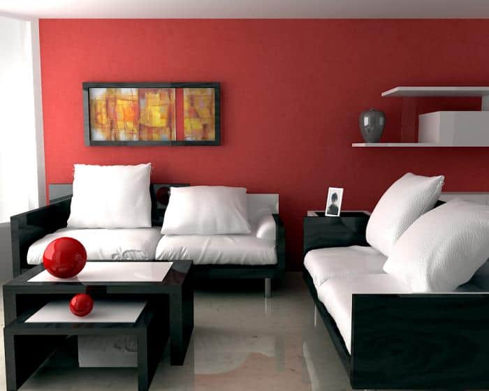
Red
If you choose red as the main color, then you ought to be extra cautious. As a primary color of the interior, it can look obtrusive. In a moderate amount, however, red will make the living room stylish and quite fashionable. Mix red shades with brown, beige, white, gold, black or metallic tones.

Blue
Blue in the design and décor of the living room is usually preferred by calm, balanced people. Blue, in the right uncritical shade can serve as the backdrop of the room perfectly as it is light in perception and unobtrusive as well. Blue can be combined with white, pearl, red or beige tones.
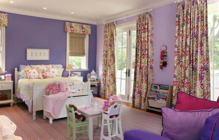
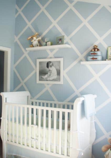
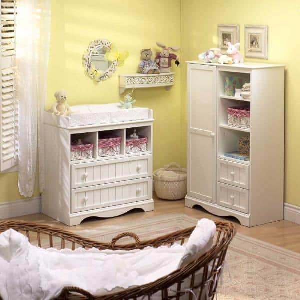
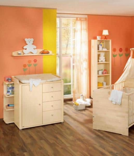
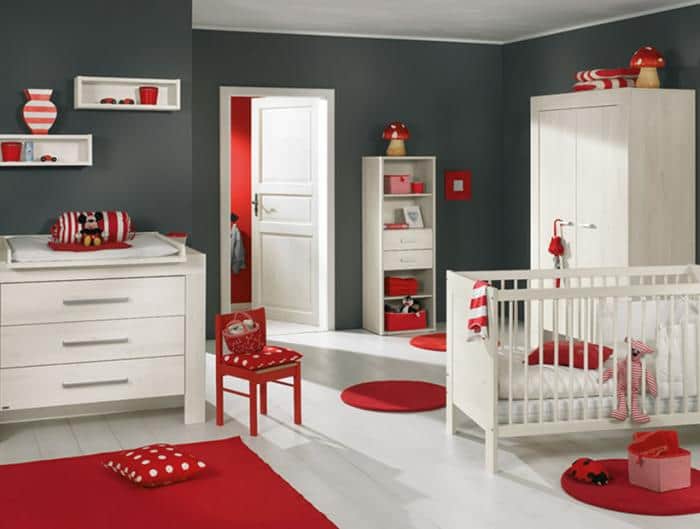
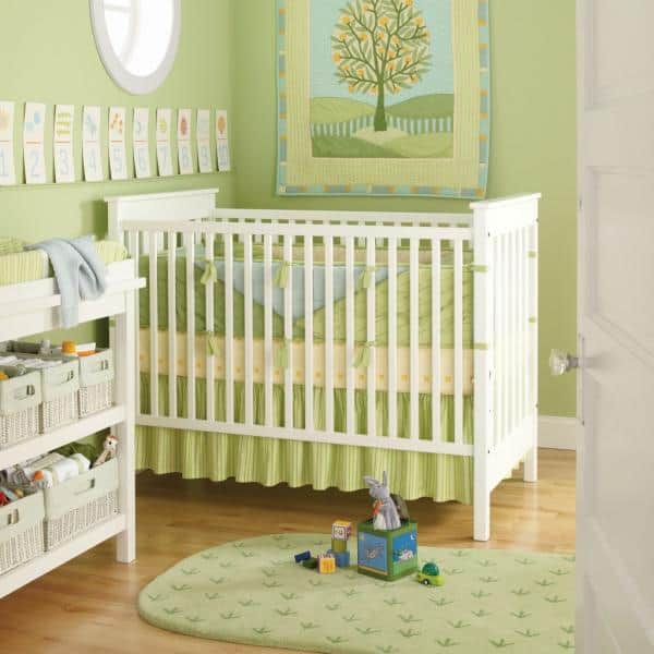
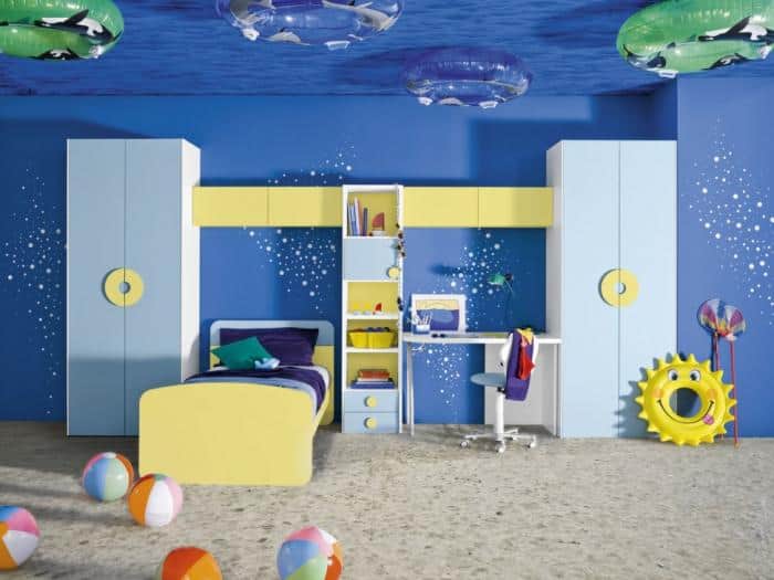
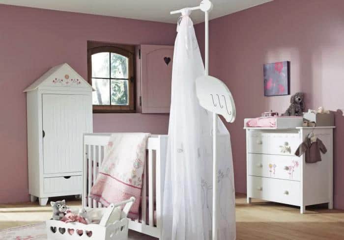
Children’s Room Colors
Color in children’s rooms is special. A child’s bedroom should ooze of bright and positive vibes. At the same time, even though color is encouraged in a child’s bedroom, be cautious not to go over the top.
White and its shades
When using white as the background color, be cautious not to overuse it. Otherwise, the room will look boring instead of bright and spacious. If you decide to go with a white color scheme for the child’s bedroom, it is advisable that you use it in conjunction with pink, light green, yellow and blue.
Yellow
Yellow can be described as bright, positive and joyful. If yellow is chosen as the primary color for the children’s bedroom, and the room itself is zoned, you can “play” with different shades (decorate the sleeping area in subdued and calm tones, and make the playing zone rich yellow). This color is best combined with white, green and blue.
Orange
This color reflects optimism and good vibes. It is perfectly suitable for rooms of both boys and girls.
It goes well with lilac, white and blue.
Red
Just as it should be used cautiously in the kitchen, so should it be used in the bedroom, especially in nurseries. Red creates active energy but can also be too intrusive for the child. If you still want to use it in the interior, then limit its use to just one wall. Alternatively, accompany it with other colors. Red in a child’s bedroom goes well with yellow, blue and white.
Room in green
If you choose the right shade of green – the bedroom will be your child’s favorite place. Green is an accommodating color, allowing you to create a zone that is both peaceful and energetic. Successful combinations in the nursery are green with yellow, green and white.
Blue and its shades are most often used in boys’ rooms. Without additional colors, however, it looks dull and uninviting, so it must always be supplemented. The best for supplementing colors are white, orange, yellow and light brown.
Learning to select colors
Not everyone has the ability to combine colors efficiently. However, color combination is a skill you can learn. After all, the most successful color shades and combinations were created by trial and error.


A few tips on the results of the conversation about the combinations of colors in the interior.
- Do not try to think straight through the design to the smallest detail.First, decide on the basic combination (the base color + one or two additional). Anything that can be an addition – it may well “come up” to the end of the design of the room.
- Do not “reinvent the wheel”.Use expert advice in selecting flowers for your home. Logs, catalogs, color charts will help to make the right choice.
- Choose as the base colors those that you are pleasant and familiar.Experiment better with details. After changing the color of the walls or changing furniture is more difficult than replacing the small details of the interior.


